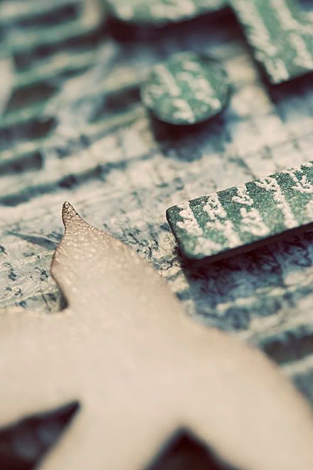
this is a happy marriage of traditional and very non-traditional scrapbook supplies!

that is all i'm showing for now!! i'll have the rest of the photos up next week. as well as information on the date and time.
it will give you a taste of being messy...in a safe and introductory way!
these classes have been awesome. it has been a challenge for me to find new ideas and combine it with the supplies. i love it! at times i think that i will never be able to find enough new ideas. then i come across a new one that is really inspiring and totally works. it is one thing to create the layout and an entirely new task to think about how you got it from start to end! never mind being able to communicate it to an entire class. this is the kind of challenge i enjoy! which is a good thing.
flowers are a huge trend right now and not always everyone's first choice when it comes to all scrapbookers. they are an easy and excellent embellishment and i've come across a lot of people who still struggle with adding a flower to a layout about their boys. in my humble opinion i think most layouts are neutral. there are the obvious pink and frilly layouts that scream girl and the brown or rough layouts that automatically make you think boy. i also think that my daughter does not have to have every layout done in pink or have flowers attached to them!
so that is one challenge is to keep them neutral. i think i pushed my limit when i used pink ribbon on the February layout. however, with it being valentines and the month of love....never mind finding the perfect papers from Making Memories! there was still lots of brown and cream. as long as it doesn't happen every month i doubt anyone will complain. this one doesn't have even a hint of pink...i wonder if that will be a problem? ha!! i'll keep you posted.
here is something to challenge you:
years ago i took a watercolour painting class. our teacher was the most amazing artist. she removed our thinking that we had to paint mountains grey, trees green or water blue. because of that class i had an entirely new appreciation for nature and art. we painted mountains purple and blue. trees became any colour under the rainbow. water became less blue and more of a mirror. she emphasized that our eyes can quickly find a tree or rock. with art, it is more appealing to the eye if we make the brain work a little harder to see it. {words to that effect, anyway!} cool colours like purple emphasize distance, while warm colours emphasize proximity. it was the first time i painted a picture with PURPLE trees.
look first at the layout and think of what your eye sees. if you have to ask yourself, "what colours was that exactly?" then i truly doubt you will have to worry about it being "girly" or "boyish". most likely you have just viewed a neutral layout. phew!
i find it so fascinating learning about how our brain and eyes work when it comes to art.

No comments:
Post a Comment
Thank you for taking the time to comment!