Showing posts with label design team. Show all posts

Friday, 7 March 2014

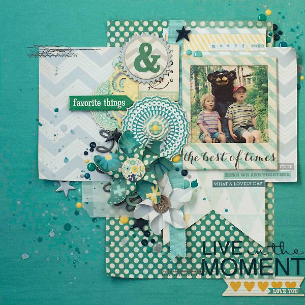
live in the moment


this photo was taken in 2009. my babies seemed so grown up at the time. my oldest was just about to start kindergarten and my youngest would soon start her first year of preschool. their lives were so simple. as their parents, ours was not quite as much! however it definitely reminded us to enjoy each moment despite the quickly passing days.

 photo LiveintheMoment.jpg

this has been a fun year for the design team at Urban Scrapbook. each month has a new challenge. this one was to follow a sketch. i did an entire year of classes creating layouts on a variety of sketches a few years ago. you can check them out here. if you have not yet tried creating layouts or cards using a sketch, you do need to give it a try. sometimes they end up looking exactly like the sketch and other times it looks nothing like it. as you go through the process of putting the papers and photos together, it eliminates the questions: "does this arrangement look ok? would this embellishment look better here....or here....or here...?"

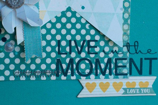
 photo LiveintheMoment4.jpg

if you have not tried it yet, you MUST buy the Xyron sticker maker. i pop my letters inside and it puts dry adhesive on the back of them. it's seriously the best thing since sliced bread.
and if you have not tried the "Wink of Stella" glitter brushes....well....get with it! don't even bother to ask me which colour you should get. i'm still in debate over which one would be the best addition...because you definitely need them all.

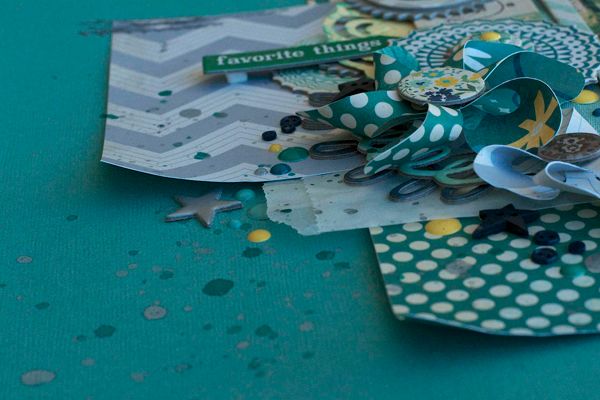
 photo LiveintheMoment3.jpg

i confess that i tried a few techniques on a few other sheets of paper. did. not. work. like. i. wanted. sigh. i think they will work for a different set of papers....but i didn't have much time to mess around and bring them around from the dark side. some days are like that. onwards and upwards!

i hadn't made these pinwheels in awhile. they are just plain fun to put together. after making a big mess of things i needed a little pick me up! haha!

as you can tell blogging and scrapbooking have fallen through the cracks of my life for the past bit. it might look like i'm stepping away from one or both of them...but i'm not! honest. i'm trying to balance my life between work, family and this incredible hobby. i was just thinking that i should create a page comparing my first classroom to my present classroom. the differences are enormous.

stay with me. i may not be posting as frequently as i used to, but i'll still be here. living in the moment.

Monday, 13 January 2014

frozen

January Monthly Kit at the Urban Scrapbook

the new BoBunny Woodlands Winter papers are incredible. i had trouble picking a favourite paper out of the kit. love original designs like this!

there is also a snowflake stencil in the kit that is a lot of fun!

here is my layout:

 photo frozenfull.jpg

i tried several techniques on the background page as well as bits of pieces on other papers.. lots of fun! a snowflake stencil is included in your kit, so it was a fabulous excuse to think of many different ways to use it.

 photo frozencloseup1.jpg

i cut some detailed snowflakes on my Cameo. then i added clear glass glitter. i love the look of the glass glitter against the white snowflake. it looks just like frost!
it is a bit difficult to see, but i also cut a snowflake from the Tim Holtz Frosted Film with my Cameo. it cuts it perfectly!

 photo frozencloseup2.jpg

to make the title thicker, i cut out 3 layers from chipboard and adhered them together. the patterned paper was adhered on top. it is hard to tell the glimmer on the title. i got that effect by using a Wink of Stella glitter pen. love that pen!! i haven't gotten the look from any other technique i've used...it's totally unique.

another part of the kit are some clear rhinestone crystals. i kept some connected as they were in the package and cut others apart so that they were singles.

there are some more designs on display at Urban Scrapbook. as usual, the design team members have so many different styles and this kit was perfect for all of us. go, check it out and be inspired!

Friday, 11 October 2013

it's the Halloween Countdown!

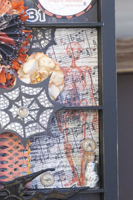
chalkboard and glitter. fun!

Happy Haunting by My Mind's Eye has them both.

 photo octoberDT2013.jpg

i love this skeleton. i really think it stole the show in this collection.

i had a halloween countdown item that had a really ugly picture on it. but i loved the countdown idea. it was a perfect opportunity to make it look pretty. of course we are down to 20 days until Halloween...

it was a rosette making storm in my studio! i hadn't made these in a long time, and suddenly i used them on both of my halloween projects. what are the odds?

 photo octDTcloseup2.jpg

i totally love how the pumpkin turned out. i used the Flourish and Wings Texture Fade by Sizzix. although i was wishing i had the Halloween Words and Cobwebs...a spider web would have looked really amazing though. we were given the orange Core'dinations cardstock with a kraft core.

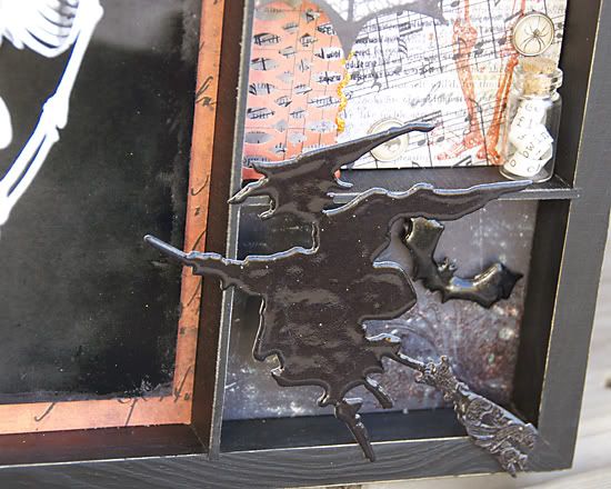
those little vials are so fun. i've filled them with sand, glitter, beads.... the yellow one is a mix of yellow re-inker, water and gold glitter. the black one is microbeads and black ink spray. i coloured the cork tops with some black and dark brown ink.

i took the shine off of my binder clip with some nearly black Inka Gold metallic rub by Viva.

 photo octDTcloseup1.jpg

i cut out a spider with my Cameo. added silver Inka Gold metallic rub to the web. then pulled out some ancient Doodlebug crushed velvet flocking to make him furry. i think black Distress Glitter would have looked awesome.

i also cut out the words: "days until" with my cameo. i added adhesive to the letters using my Xyron Sticker Maker. that little tool has been around longer than i've been scrapbooking.....but it is awesome! no runny liquid glue distracting my layout.


i was "oooohing" and "aaaahhhhing" over the other projects the girls made at Urban Scrapbook with this kit. many of them used the Apothecary Bottles Bigz Die to cut out shapes for their projects. as well as a few of the other new Halloween dies and embossing folders. they are so inspiring!


Saturday, 31 December 2011

happy new year

one more day left in 2011.


when i was in grade three i recall writing stories about what the future would be like. if my memory is correct, the dates we often used were something like 2012 or 2025. at the time those dates were so far away and we all thought we would be soooo old! we would also no longer be driving cars....instead we would have personal flying space ships to visit other planets. and i can't forget the jets that would attach to our bodies so that we no longer needed to walk anywhere.

Aidan is chatting about some of the same things. as much as time passes, there is much that stays the same.


my first real scrapbook layout was actually an album i filled using photos from our first family vacation in 1996. Kristian and i rented a car and drove to Vancouver Island. i still think it is cute. every vacation we had was remembered in its own album. we only went on one major week long vacation each year, so it was easy. each time i created an album i invested in a few new tools. trying something new and different was as important as the pages that were completed. i also was never the type to include a lot of journaling. even back then. instead i found songs and poems that meant something to us at the time and wrote them out to correspond to my photos. all in all, the albums were kept simple.

my pages have become more complex and time consuming than they did when i started. they still tell more than the story in the photos. i still like to use new tools and techniques on nearly each page i complete. for the most part i have very few duplicated designs of my own pages. it is as much of the artistic process as it is documenting the special photos. i still do not add much journaling. i prefer to use a line from a song or poem in my title or page when i can find something appropriate. the big difference is that i kept the same type of technique or design in the entire album. now it is kept just to a single page. that design style began in 2004 when i started to put together a baby album for Aidan.

as much as things change, much still stays the same. the albums and pages may have changed...but the content that is meaningful and important is the same as it was originally.

i wonder if that will be something that changes in the future? will i decide to add more journaling and feel it is more important? one thing is for certain.....time will tell!


this will be my third year on the Urban Scrapbook Design Team. i feel like i have grown immensely as a scrapbooker since i started this design team. amazing what support, encouragement and shared ideas does for a person. before i joined the team i looked forward to checking out the display each month and guessing who did which layout. i still enjoy that part! back then, and now... i find it neat that each person has a specific type of style that sets them apart from the next person.

this year the theme is to base the layout on our interpretation of a provided sketch.

and....

the challenge to use ONE photo this month. next month will be TWO. which means December will require TWELVE. yikes!

Photobucket

i didn't think to scan the sketch and include it here. i'll have to remember to do that next month.

the pine cones and roses were both created using Tim Holtz Tattered Pine Cone die. the roses were made larger by adding two layers of medium sized flowers from the Tattered Florals die. i love that pine cone die!!

Photobucket


Photobucket

you can even double up the pine cone die cut to make a larger pine cone. i think it is too bulky for a scrapbook layout. which says a lot, because my layouts tend to be very bulky and lumpy!

Photobucket

and i have another new embellishment addiction. sigh. just before Christmas Urban was selling various types of German glass glitter. the stuff is fantastic! i snagged a bottle of clear glass and one that had mixed gold and silver. it was that latter bottle that had the biggest surprise for me. thank you Jaslyn!! it has some glitter and micro beads on various sizes.

Photobucket

and so i used bits from both jars on this layout. seriously i could not stop adding the glitter! if the kids had stood still long enough, they probably would have been the next victim of my creativity!!

now all i want is more metallic colours in that kind of mix. or could i use my alcohol inks....


we would love to see the designs you create if you purchase the monthly kit. join us in the fun!!


until then,

          i want to wish you a Happy New Year! may 2012 hold a multitude of blessings and amazing memories for each of you.

Tuesday, 6 December 2011

tis the season to be jolly!

the Lost & Found Christmas line by My Minds' Eye is yet another set of papers that needs very little to make a beautiful page.

the design team really knocked this one out. we all have the same challenge. same papers. sometimes our embellishments are slightly different, but this month we all had the same materials to start with. it always amazes me how our personal styles and creativity sends us all in unique directions.

our challenge was to ALTER our embellishments. we had chipboard, acrylic, light metal foil and wood.

the real challenge is to choose the right photo. i had already used my tree on another layout. if my tree was an amazing work of art...perhaps i would have scrapped it twice. but that is not the reality. instead i got "real" and shared the reality of the 20 bad pictures behind the ONE GOOD ONE. for some reason i totally missed the "jolly-ness" in our kissing photo until i examined it more closely. the expressions on the kids' faces are priceless. the irony is that i don't think they knew we were smooching behind them! one day this layout is going to be sooooo embarrassing for them.....

Photobucket

the Maya Road wooden mini snowflakes are seriously so cute just on their own. but they do allow for some interesting altering!

the foil papers by Spellbinders are so neat. on their own they are dramatic. but they allow you to dress them up even more. the "wrong" sides of all the pages are silver. i used a red alcohol ink (cranberry) to change the brass to red. red is a strong colour and since it was in my photos, i decided to keep it strong in the rest of the layout.

Photobucket

on one of the whimsy circles i also added some red tinsel glitter. i love how it adhered itself! it looks like mini tinsel. a pleasant surprise.

for my lamp post i inked it in black. paint would have worked equally as well. then i painted it in Rock Candy Crackle Paint. next i inked it with Copper Mixative (alcohol ink metallic). i also used some of the blending solution to lighten it in areas. to finish it off i used some more black ink to ink up the edges.

micro beads came out again. i also combined them with alcohol inks.

the Danish ribbon was pretty bright for my palette, so i darkened it with some distress ink.


i can't believe this is the last layout for 2011. Jan had some excellent challenges for us. i have a special album for my design team projects at Urban Scrapbook. it is now full, so time to start another album. i love looking through it. it holds memories of the photos and stories. but also the memories of the theme or challenge for that month.


now i am working on Christmas cards and gift projects. fun stuff. we started our Christmas decorating....late this year. i loved pulling out some of the projects that i had made in years past.

my favourite from 2008 is this ornament. it is too large to hang on the tree. so it finds other homes around the house. still thrilled with this and this project from 2009. my most recent favourite from 2010. so happy to have it hanging in my house for the Christmas season this year! now what to make for 2011?!

i am very inspired by Tim Holtz' 12 tags of Christmas. as well as the number of "keeners" who make a tag and post it within 4 hours! i have come across some amazing Russian blogs as a result....just wish i knew what they were writing!

i also walked through HomeSense today. lots of inspiration there too. my plan of buying gifts for other people backfired...big time. especially since i came home with items for me! the good news is that i did visit other stores and managed to succeed in my mission. phew!

Friday, 28 October 2011

coming soon!

i had a fabulous time last night teaching the first of the October year in review layout classes. i had 3 flower styles that were one of the techniques of the class. flowers are always a challenge to learn and to teach. so many layers...which one goes where?! but we had fun and laughed as we made them.

another technique taught was heat embossing. you can never go wrong with purchasing CLEAR embossing powder. especially if you have a rainbow assortment of ink pads to choose from. the clear embossing powder will intensify the colour of your ink. this time we used Versamark ink (clear ink) on black paper and embossed with the clear embossing powder. i was inspired to try this technique because of the beautiful varnished papers by Pink Paislee. so subtle, yet makes a cool statement.

i was happy to have completed the next months' layout and have it ready to share with the group. pictures are good. but nothing beats seeing projects in person, and up close. once i have shared the layout with my Saturdays' class, then i'll post all the photos here. just one of the perks for my faithful group of scrapbookers!

i will post a little tease:

Photobucket

yeah. not much of a hint!

i will say that these papers are by Simple Stories...and they are INCREDIBLE. honestly, after i started working on the layout i was very challenged by them. they really do not need a whole lot of extra stuff added! they look awesome just on their own. it was a challenge to figure out what to add, how much and where. yes, not a bad challenge to have!!

i know i sound like a broken record...but just wait until you see what the Urban Scrapbook design team has come up with now! we were given the gorgeous Glitz Vintage Blue papers.


i had been looking forward to these papers since i first saw the sneak peaks! yes, it lived up to my expectations. phew! they navy blues are amazing. not many companies use this colour, so it is quite rare. the yellows and golds are a nice pairing too. 

Photobucket

it's not like this girl is short of her share of layouts these days. but the papers were so perfect for this photo.

i took the kids out last weekend to do their halloween shots. near our home is this old house. tongue and groove log cabin. it is on the edge of a field. and the perfect backdrop for the photos this year. it was a windy day (seems like the typical day lately). it ended up working well for me. the hard part was choosing just one photo.

i'll share more details about the layout later.

off to prepare for the weekend, feed my daughter her lunch and send her off to school!

enjoy your Spooktacular weekend!!

Thursday, 13 October 2011

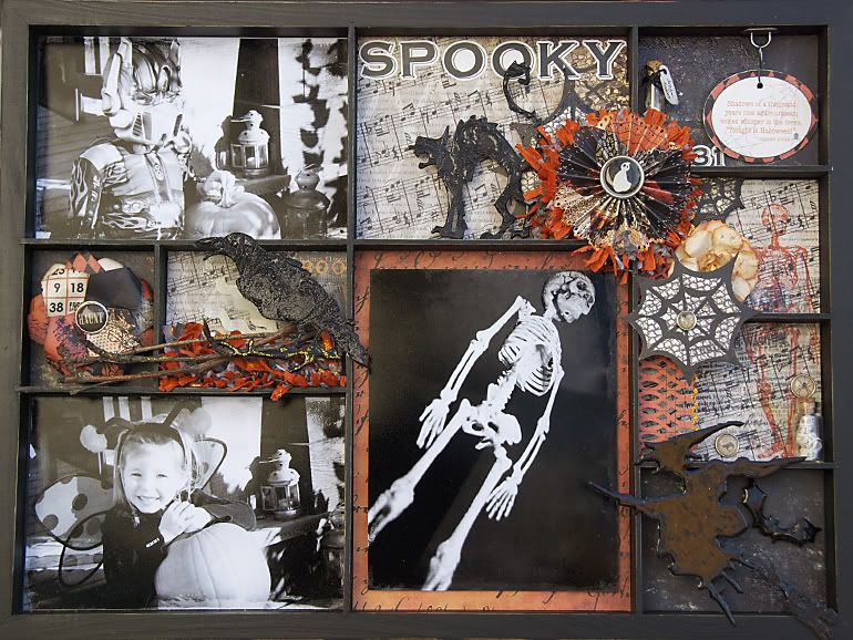
spooky

life slowed down. finally. and then i started to enjoy the slower days, i think! i took a week and read a novel in my free time. it had been awhile. it was a nice break. i feel ready to get back into creating again and not just browsing my favourite blogs to enjoy their creative work.

let's start with this project that is long overdue for sharing....

Photobucket

it was a lot of fun this month to be challenged to create a home decor item using our monthly design kits. i had mentioned before how diverse and amazing they all turned out.

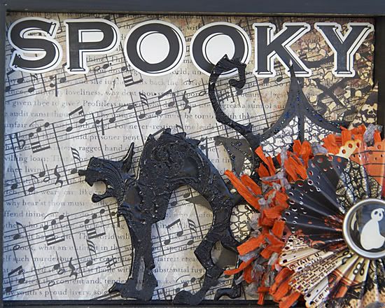
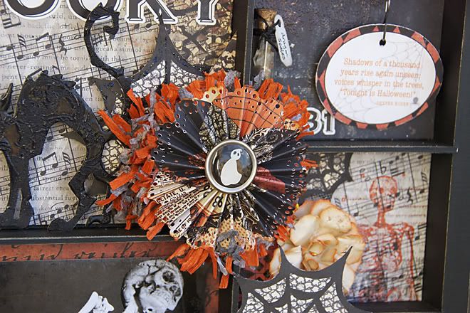
i decided to make a shadow box. the photos are from last years' halloween. i added a texture, then changed them to black and white. the skeleton photo is from a party. it was fun to try and take some photos in the dim light and bring some life to the skeleton hanging from the ceiling.

Photobucket

we had some chipboard die cuts included. i inked mine black, then embossed them. i repeated the embossing several times, and then stamped into the goo. i love the effect here.

Photobucket

i had to make a rosette. in hindsight, i wish i had made more of these! not sure why that did not enter my thinking at the time. i made another paper rose, and inked the petal edges in spiced marmalade.

Photobucket

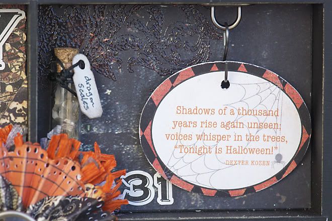
this quote is from the elements sheet that coordinates with the line...but not included in the kit. the quote reminded me of something i had heard a few times when i was younger. the "dragon scales" are actually pewter mica flakes. i love those little apothecary bottles. last year Kiara decided to be a dragon after she found out that Daddy was going to be a Viking. immediately she decided that she would be Daddy's pet dragon. ha! what a cutie!! the dragon scales are a reminder of that last minute costume change.

Photobucket

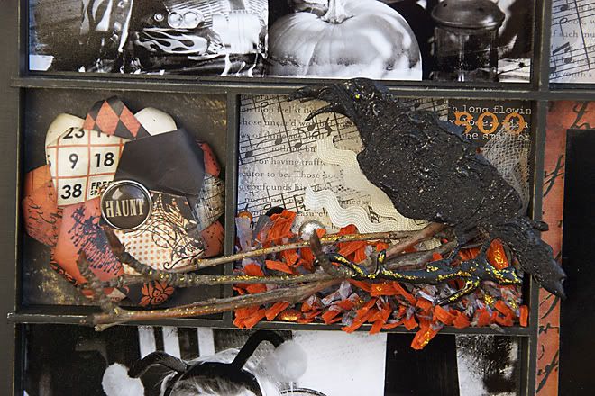
i did the same thing with the crow...just added some black glitter to the embossing powder. and that decision made it tough to capture a nice clear photo. i added extra brads and rhinestones to the background, because crows are birds who collect shiny objects. right?
the flower was simple. i cut up the diamond shapes from the one patterned paper. punched a hole in one corner, and slid a brad through it. then i rotated the petals and curled the edges under.

Photobucket

i first cut this paper into a single piece. stamped it, then cut it into 2 parts.

the vial is filled with another quote strip from the paper label.

Photobucket

this is what the chipboard looks like if you just emboss it repeatedly. i also added a bit of glitter too. you can get the same effect with using UTEE and a melting pot.

i think one of my favourite techniques lately has been to use my clear embossing powder with a variety of stamp colours. even a non-colour version with VersaMark has produced some neat effects.

but check out the store. the display is incredible. there are soooo many ideas for you to use to put together your own spooky display at home.


for now i have one more birthday to plan for. my oldest boy turns 7 years old tomorrow. i can not believe it. of course, if you ask him, he would tell you that it did not come fast enough!

Thursday, 8 September 2011

enjoying

some Indian Summer....so it seems!

i cannot believe how beautiful the temperatures are. and that we have the AC running in September!

no complaints here. autumn can take as long as it wants.

the challenge for the Urban Scrapbook design team this month was to do fussy cutting. we were given the stunning papers by Bo Bunny to use. it was tough to decide which papers to cut up! there was no doubt that the pages would be amazing when they were done. check out the gallery!

Photobucket

these photos are from last autumn in Jasper. Kris and i had a weekend away from the kids (or the kids had a weekend away from us....depends on the perspective!). the fall colours in Jasper were perfect. the photos turned out so nice as well. good enough that we are thinking it might be fun to go back this fall. however the kids are asking to join us.

EVERYTHING was hand cut. no die cutting this time. yes, my fingers were a bit sore afterward. honestly, the tool you use makes a difference. i was reminded - again - that i need to buy some replacement blades for my x-acto knife. a sharp blade really does make a difference. i also used my Tim Holtz Tonic Studios scissors. they are sharp right to the tip. (as part of my finger learned very quickly when i first bought them!) on a totally unrelated note to fussy cutting....those scissors are amazing on anything super sticky. like sookwang or super tape. they are teflon coated. i do find that stickiness does build up after a time...they get used a lot!! however a wipe with a solution of water and dish detergent does the trick.

Photobucket

then i added ink. and perfect pearls. and luminarte H20 paints. i love how the subtle pearls shimmer on the darker paper.

Photobucket

one of the elements in the kit are these velvet rub-ons by Prima. they add a neat texture to the page. the detail they have in the design is amazing too. i cut a few apart as well.

another part of the challenge was to create a tag or card. well. i still have the paper sitting on my desk waiting for me. i think a card would be fun. i've spent many hours each day this week working on other things not related to scrapbooking. things that i never dreamed would take so long! sometimes priorities are not so fun. one of the projects is complete and the other just has a few hours left. the things we do for our kids!

Saturday, 30 July 2011

happy campers

i'm wondering what it would be like to be permanently on holiday. would i ever get tired of it?! the kids and i just returned from almost a week away. we met a good friend and her daughters at their cabin. not far from here. and it was so relaxing. time slows down. we have had 'cabin withdrawal' for a few days! bedtimes and meal times were the only parts of the day that required "work". other than that the kids all played and let the grown-ups enjoy ourselves. we also made some new friends. our cabin time overlapped with another friend and we met some kindred spirits.

when i came home i had just enough time to shower before my year in review scrapbook class. thank goodness for my students! i was worried we would have to move it out to the parking lot for their sake. yes. campfires every night and no regular showers. a perfect mix for life away from people.....

the next day i set to finish my design team layout. the challenge was to use hidden journaling.

Photobucket

i have 3 spots with hidden journaling. i think 2 of them are rather obvious.

Photobucket

the "arrows" point the way. teehee!

Photobucket

we had a grunge paper suitcase die cut included. i used distress stains, then crackle paint and finished with some dark distress stain for the cracks. i also used some alcohol ink metallic mixatives on the corners.

Photobucket

a combination of the copper mixative and espresso alcohol ink changed the blue/antique gold look of the hinge, arrows and silver number. what an easy fix! i even inked the brads.

Photobucket

the seam binding is one of my favourites these days. i used tumbled glass, bundled sage and tea dye ink pads. then misted them with water. when it was nearly dry, i rubbed it across the ink pads again. added more contrast. i have my third hidden journaling in here.

i saw a few of the layouts today. amazing work. i can't wait until they are all on display. i got some more ideas to implement hidden journaling. i love these kinds of options because it is another way to also add photos or memorabilia that doesn't fit in with the rest of the layout. if you are like me and get picky about things like that! i have to say that i am more inspired to add more journaling to my layouts and include the story behind my photos.


it feels good to have also finished the next year in review layout. i still have to write up my instructions. i'll do that right away. before i forget half the stuff i did. i was thrilled to have received a positive response from both classes.

here is a sneak peak. even though the layout is now on display at Urban Scrapbook.

Photobucket

a layout to display photos for camping. or fishing. or hiking. or any outdoor activity where trees and wood were a part of the scene. i think we all have a few of these!

i will share the rest of the photos soon enough.

Friday, 8 July 2011

summer vacation time!

we have had a good start to our summer. i am doing what i can to get us to enjoy the outdoors when the weather is cooperating. i had heard that rain was on its way, so we enjoyed as much of the hot weather at the start of the week as we could. even though we had to endure the mosquitos to do so. my poor kids! their skin is glowing....and bumpy!! with the rain, the mosquitos have vanished. but i am sure they will return again when the sun is shining. what happened to enjoying mosquito-free sunlight, and enduring they pests when the sun starts to set? yeesh!!

that last week of June was crazy! i feel like i am still on "work-work-work" mode. since i am feeling it...i am going with that motivation. no breaks. i prepped stuff for my class this month. have you counted the number of gears on that layout?!! 15 gears, cut from 4 different types of paper. i prepped for 20 kits....so that makes 300 gears piled on my kitchen table. i had to also cut out a hanging sign, two of them...40 in total. then the clock...times 20. then the word "IMAGINE"...20 times. then "DREAM" and a border die from the same paper....no, not confusing at all!!! know what that adds up to? 420 passes through my Vagabond machine. i thought i was done...but i just realized i have to get that border die out again and cut out 20 envelopes. 20 seems like nothing compared to 420. ha! did i mention i kissed my Vagabond when we were done? oh, that machine is so amazing. AND it looks so awesome on my table when it is on a break. sigh.

i'll share photos soon....but i also finished up my tag challenge. early. i probably mentioned that before. it's just that i am so happy to be done BEFORE the deadline. i hate to be late, so it bugged me to be the last tag finished the first 2 rounds.

i can't remember when i started the project....maybe around March? i wanted to use a configuration box
for Kiara. i can't remember if i came up with the idea myself, or if it was after i saw Laura Denisons' Fairy Box. that is how long it has been! regardless, once i saw Laura's box, i was super inspired. i used a different set of boxes, but i used the same paper....Graphic45 Once Upon a Springtime. i loved how her boxes were arranged, and took the same idea for mine. well....i finished it....FINALLY!! it feels good to be done, and have the mess cleaned up.

i have one outstanding project to finish....but it has been 3 years in the process. a mini-album to summarize Kiara's second year. i made one for Aidan, and bought a similar album and paper for Kiara. in fact all the paper has been cut to size. my hold-up? choosing my photos. i should add that it is a simple mini-album....nothing elaborate at all. here is Aidan's. and here are the plans for Kiaras'. at the time i felt bad because it took me 2 months to finish the one for Aidan. hmmmm..... if i wait long enough, Kiara can do it herself!

i'll be sure to share the photos of the completed projects soon.


in all my eagerness to get ahead of the game....i realized i hadn't shared my recent design team layout....

Photobucket

the papers were from the new Simple Stories company. they have an interesting design behind their business. the papers work well on their own, but they are also designed to simplify scrapbooking. although there are companies that make products for simple scrapbookers...i believe this is the first (besides Becky Higgins) to create products specifically for people who want to document everything. you can read about that vision here. however, i don't fit that style. i love to make it as detailed and time consuming as possible! ha! that said, i have used a few of their papers already....and i LOVE them. i found the cut apart blocks worked perfectly for cards. good design.

Photobucket

our challenge was to use embossing on the layout. i like how the one folder makes the bingo cards look wet. for the dots, i inserted the entire page into my Vagabond. all you have to do is fold your paper under the thicker shim.

Photobucket

and used my new rosette die. and the banner die. it felt like i was cheating to make them this way! i was in a time crunch, so it was all good.

we also had the Melissa Frances crepe paper. it. is. amazing! i cut it in half (lengthwise), misted one piece then sewed them together.

Photobucket

love the Bakers' Twine.

we also had some Kraft Glassine paper in our kits. i wanted to use more of it...but couldn't make it work with the style i had chosen. i have the un-used pieces still on my desk to prove it! instead i punched mine with a butterfly punch 3 times. added perfect pearls in blue and heat set it. then wrapped the bakers' twine around them.

i had to laugh when i pulled out my Fiskars  Deckle edged scissors. they were one of the first tools i bought back in 1996.


in my spare time i have been checking out the sneak peaks for the CHA Summer show. Graphic 45 still continues to impress me. Pink Paislee has a Mistables Collection that should be popular. My Mind's Eye has a Lost and Found Christmas line that i want. Bo Bunny has another cool line called Et Cetera that looks incredible. of course Tim Holtz has more stuff i want already. and he hasn't even shown any alterations dies yet. Little Yellow Bicycle is bring Twig back....in a winter collection. from the sneak peaks, it also looks like a best seller. Glitz. wow. enough said. i am curious what Crate and Cosmo Cricket will have. i haven't checked the others yet.


in the meantime....Aidan helped me pick out some sewing heads for the WRMK Sew Easy tool. actually he used it today, successfully! which means i should be able to use it too. i was thrilled to grab one of the "doily dies" from Cheery Lynn.  yup! it works great. Jan made a beautiful layout using one of the doilies with some metal paper. i'm looking forward to testing it out on some layouts too.


i came across this video on Elizabeth Kartchners' Twitter update over a month ago. she posted it on her blog as well. watch it and try NOT to laugh. i dare you! even my non-scrapbooking husband thought it was funny.... Cleetus' price of his handmade flower, $1200...took him 14 days straight to make it! or his items that he has collected to make scrapbook pages...


enjoy your weekend!

Tuesday, 24 May 2011

smiling!

i spent a great deal of time this past week looking at photos of the kids. Aidan had a project at work that required a few photos and it took a bit of searching to find them. i don't have all of them in iPhoto, so it sure makes it tough. i need to think on a strategy that will work for me.

last summer was a bit of a bummer. not so many hot and wonderful days to enjoy. i'm thankful for the photos i did manage to get of the kids.

like this one.....

Photobucket

she tried out a couple of different water guns at my friends' cabin. it was really funny! once they were filled with water she could barely get the coordination and strength to actually soak anyone. however it made her a perfect target.

this page is for the June kit at Urban Scrapbook. our challenge was to use borders. i love that we often get products in our kits that are new to me.....but i also love that we get some that are typical of what i buy. our kits are quite popular. they are fun to try, especially if you are in a slump and just need a change of routine. sometimes a particular embellishment is included that you maybe never thought about using....and you discover it is perfect for you.

as always i am excited to see what the other girls came up with. it's fun to see how we all end up with such different techniques and such. i've always enjoyed trying to guess which layout belongs to which designer. sometimes it is easy and other times it is nearly impossible. of course the photos often are good hints!

Photobucket

as soon as i saw the 'thermometer' design i really wanted to do something like this. the watermelon patter was the perfect size for one of my circle punches...that helped. then i came up with this flower. i love how it worked out....most likely i'll try it on some more layouts too.

pinwheel flowers or lollies or rosettes (depending on who is talking) are perfect for long borders of cardstock. use a border punch and add some interest to the outer edge. it is so amazing how unique it makes them. i think i have had a rosette on every layout for the past few months. can we say 'addiction'? i'm sure there is a support group for others like me out there....

Photobucket

i wasn't sure how to work in the pins at first. i was pretty excited when i came up with this plan. another technique i will have to use again. love it when that happens.

i've been working on teacher gifts too. only because i love to stress myself out and see how much crafting i can squeeze in! eventually i do need to finish that cute fairy configuration box for Kiara's room.

also my next class is this week. hooray! it is a fun one. {i still have a couple of spaces for Saturday morning if you are interested} i was late posting it on 2Peas, and totally overwhelmed by the response. it made it to the top view for the day. so there was more happy dancing going on in our house that day!

a sneak peak of the next class is coming soon too. i'm looking forward to sharing it!

Pat shared a display of the tags we swapped. check it out here. and take a look at her creation here. i love  them! i may totally copy Pat and pick up one of those ticket holders to display my set. i still have a library drawer that is awaiting a purpose too....

Wednesday, 27 April 2011

lost and found!

getting back to routine has been a tough one! if i could sum up the month of April....it would be 2 events....holiday and recovering from the holiday. not really a bad theme.

we have all found it tough to get ourselves back into a routine again. i think we may have figured it out after this last long weekend. the weather was absolutely incredible and lots of time was spent outdoors. it was just what we all needed. i loved seeing the kids so happy and enjoying the seemingly endless days with their friends. even if it meant having the entire neighbourhood in our backyard. or so it seemed!

i have a few projects keeping me busy. the first on my list was the design team layout for Urban Scrapbook. i was over the top excited with the choices in the kit. Crate Paper really hit the jackpot with this boy line. it incorporated every boy playtime toy or game. okay, not ALL of them. but the popular ones! they have been a favourite company for awhile now. always great stuff, but their latest products are so amazing.

Photobucket

the challenge was to use Distress Stain. seriously one of my most used products these days. i can count on one hand the items on this layout that DID NOT get any stain on them. ha! i edged all the papers and chipboard elements. even my photo. yeah, i know. wouldn't want anything to get missed!!

one of my most favourite uses of the stain is to use it as a watercolour paint. or to add water and let the ink run. or move it myself with my heat tool.

Photobucket

i just realized that i should have rotated this photo. next time! i didn't do a solid colour of stain on this wood frame, but added some water to get a bleeding look. once it was thoroughly dry, i stamped on it.

Photobucket

then i added some "splats!" with my dauber top.

i hadn't tried working with the new Maya Road zipper trims yet. it was a lot of fun playing around with them. i remember using zippers was trendy for a short time when i first got serious about scrapbooking. apparently they were ahead of their time....zipper flowers and trims are on lots of clothing now too. no big surprise that the scrapbook world snapped up the trend once again.


okay, off to finish the next project. soooo excited to teach my April layout this week too. i am so nervous....i hope the girls like the distress stains as much as i do!

Friday, 22 April 2011

Happy Easter!

so it seems that SPRING may have officially arrived in town. so happy it is here, but now i can't wait for all the snow to disappear. i also can't wait for the first spring rain to wash away the snow mould and dust.

last year i was pretty excited to clean my dusty windows and screens {....which the previous owner didn't bother to do when she moved out!} only to have those clean windows covered in more dust when the nearby fields were seeded, and the screens covered with tree "fluff" a few weeks later. not one to do more work than necessary.....i will wait awhile longer and live with the dirty windows so that i only need to wash them once this year!

i was also blessed with seasonal allergies. a gift that i apparently passed on to our son. another reason for a spring rain to wash away the snow mould. i want to open our windows and enjoy the warmer spring air....but don't want any extra allergens in the house. sucks to be us! itchy throats are not at the top of our list.

slowly trying to get back into routines. i had forgotten what a good holiday does!

i know it is nearly May, but i had not shared this earlier. we had some major computer issues last month that finally got solved right before our holiday. apparently i am very computer dependent. ha!

Photobucket

i think i mentioned that the Urban Scrapbook Design Team had to complete this page in record time. looking at the pages, however, tell a different story. they look like we spent weeks on them. (well...maybe not mine but the others on the wall!) this months' pages are my favourite. the technique was to do stamping. i think every stamping on paper and tissue technique was used by all of the layouts. you can see a different technique on every one of them. amazing work.

this photo is of Kiara from a few years ago. this girl LOVES her chocolate. it was the first time she had eaten a Cadbury Easter Cream Egg. i sooo need to work on adding journaling to my layouts.


Pat has had me doing the store Make and Takes lately. they are a lot of fun. for some reason paper and glue gets us all giggling. ha! i love that scrapbooking is such an enjoyable hobby. i also love that fun people also share this hobby with me.

Photobucket

this is the easiest Easter craft ever!

those bright plastic eggs that are found in abundance these days? use that as your base. just wrap the Tim Holtz Tissue Tape around it, so that the bright plastic is covered by the tissue. it's cool that it looks like a paper mache project....but without the gluey mess.

the tissue tape looks cute on it's own. however some ink can totally add some character to them. any ink will work. use your favourite ink pad and rub on some dry ink. mist it with some Ranger Colour Wash. rub on some Distress Stain, then wipe off the excess with a paper towel. or dab on some alcohol inks. every ink will produce a bright or muted colour. it all depends on your preference.

we decided that it needed some glitz. we rubbed on some stickles to cover the surface. the stickles reacts with dry ink and makes it bare in some spots, and doubles up the ink in others. with the faint colours, it makes a neat vintage effect.

i have been wrapping eggs in my spare time and filling a wire egg basket i picked up at HomeSense in the winter.

Pat thought up another cool option. we cut off a portion of a steel kitchen scrubber and inked it with some alcohol inks. (any combination of colours will work) then if you pull out some of the wires it totally looks like a nest for the egg! how cute to use an entire scrubber and line the bottom of a shallow basket...then fill it with the tissue paper eggs.....hmmmmm......

it's a cute craft and very quick to complete.


i have been struggling this week with creative block on my layouts. i have a few that i need/want to get done and i'm probably stressing out too much over it. i had hoped to have all my creative ideas erupt on a few pages and be thrilled with the result. ha! in. my. dreams. instead nothing creative came to my brain. after a few days, it has been getting increasingly annoying. the good side is that my house is clean. i say that because when i am busy working on crafts....the house cleaning makes its' way to the bottom of my to do list. the basics get done....but after a week of notes from school, art projects, toys, books, etc....the place looks like a bomb went off! and we won't even mention what my craft area looks like.

today i am going to work on some layouts that i hope will get my creative juices flowing again. projects that i don't have to share if i hate! ha! i think it is just time to mess around and not worry if the final outcome is "perfect". wish me luck. {'cause i know i will need all the luck i can get!}

my final back up plan is to pretend i have nothing that needs to get done, and just take advantage of the clear skies to take photos. or organize something else that has been ignored. hopefully i will not jump the gun on the window washing....


i wish you a Blessed Easter.

Monday, 28 February 2011

hello? spring? are you there?

it's cold. snowing. windy.

this does NOT look like spring.

where, oh where, is spring?!

will it come this year?


aside from the falling snow, i taught a couple of classes this past week. we had glitter falling and flying through the air! very messy and a lot of fun.


one of our Urban Girls was recently added to the Creative Scrappers design team! congratulations Jody!! it's great to see other fabulous CANADIAN companies and blogs. they have great taste in choosing their designers too....Jody is soooo creative and inspiring!!!

Jody introduced us to the Creative Scrappers blog and their sketches as well. i see that i am not the first to try one of their sketches this month! in fact, i found this sketch really helped me focus on my layout for our store design time layouts.....


this sketch was from last week.


and here is my interpretation....

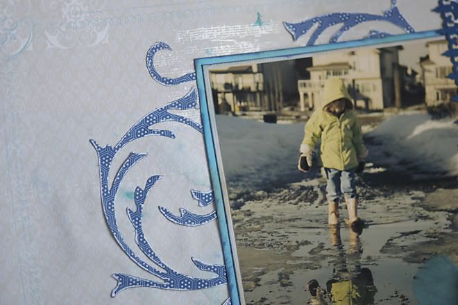
Photobucket

the technique was to use border punches. in this case i kept it pretty simple. i loved how the Iron Gate border punch by Martha Stewart looked with the Little Yellow Bicycle papers. there are a few borders - barely visible - on their patterned papers that look similar.


Photobucket

since it was a photo from last spring....and it had to do with puddles...i decided to add a few of my own! i dropped some colour from Carribean Blue glimmer mist onto the background page, then spritzed those droplets with plain water. i love the effect!

their was another fine detail of music notes on one of the sheets....so i stamped some music notes at various spots as well. i used my pearl paint dauber, and a mix of Carribean Blue Glimmer Mist and Dirty Martini Glimmer Glam (green). the glimmer colours were just puddles on my non-stick mat, so they are not clean and crisp images.

to follow the sketch with the circle, i decided to use my flourishes die from the Tim Holtz Sizzix Alterations.

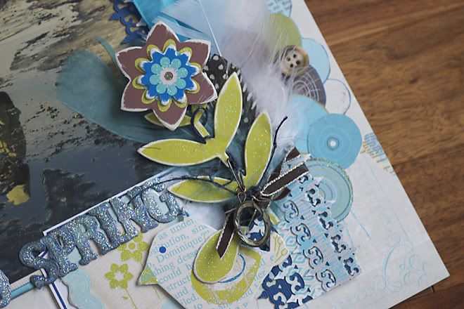
Photobucket

the letters we used are grungepaper. seriously, that product can handle layers of all types! there is no secret to the final outcome. it was just a result of lots of attempts to colour match. i started out with my pearl arcylic dauber. then i decided it needed more colour. spritz of blue glimmer mist. too light and too blue. then i added the green glimmer glam. too green. more mist. more dauber. more mist. then the glitter in the glam looked more like lumps than glitter! out came my iridescent glitter. it matched the Little Yellow Bicycle glitter perfectly! and my ugly lumps disappeared! ha!!

i LOVE how the other girls used their punches. lots of variety. i do like how i layered my paper with the punch, and turned it into a  decorative strip. BUT, the girls really showed the versatility of the border punches with their layouts. so do check out the pages that will be on display starting this week. they are sooo inspiring!


stay warm! and keep out of the drifts.

if you see signs of spring....could you send it our way? green grass will be such a pleasant sight.

LinkWithin

Blog Widget by LinkWithin