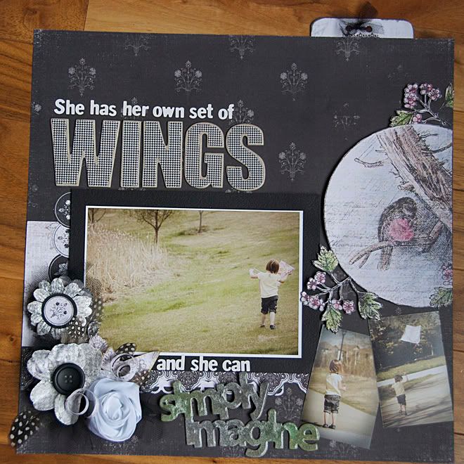
i had the hardest time trying to pick which photos to choose. always a very good problem to have.
i had wanted to put both of the kids on the layout, but as i worked with the paper it seemed that Kiara's photos needed to be the only ones. i also changed my title a few times. i hope it is just a phase, but i've had a few layouts lately that i've over-thought too much! in the end, i was really happy. too bad i couldn't have found myself at this spot earlier. such is life.
all of the contents were either black and white. except for some Maya Road chipboard words. we were also challenged to use at least 3 photos.
it was a lesson for me in: what can go wrong, will go wrong. and will most certainly go terribly wrong.
also a lesson in: keep calm and carry on.
read on dear blog reader....

i LOVED the bird. initially that paper was going to be my background. instead i cut it out and used my chalk pastels to add some colour. they had been collecting dust on my shelf for many years now. i apply the chalk with Q-tips...works great. only cut off one flower and a bit of a branch. not bad i think! i used an exacta knife for the entire piece. that was a first for me. so far so good.

i nearly did not use the flowers.
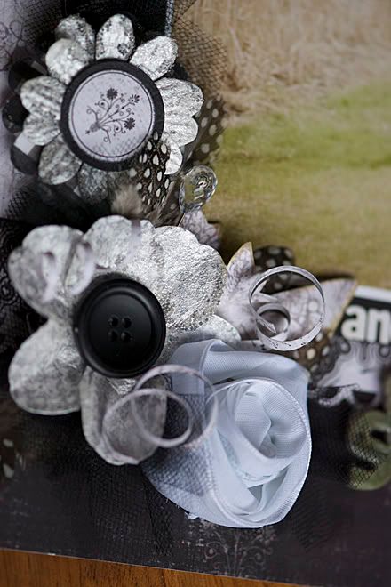
my Smooch Spritz spray nozzle got clogged and i didn't have any mini-misters to pour the spritz into. don't leave alcohol inks in them for a long period of time...or perhaps don't store them flat? whatever i did, it was the wrong thing to do. when i sent to spritz the flowers with a lovely spray of silver foil, i got big globs and my flowers looked bad.
i added some vanilla shimmer and wished i had simply gone that route the first time.
then i stamped them with my Glitz houndstooth stamp in ColourBox blackbird pigment ink. {don't rub those pads across a stamp surface! that lovely cat's eye pad tore off my holder. could anything else go wrong?!} it was not a good combination.
just before i threw them in the trash, i pulled out my pearl paint dabber and coated them thickly. crisis resolved. however, they look really silver. considering they were beautiful pure white to begin with!
since they were already very unique i figured i'd keep going. no, i don't learn life lessons quickly. or easily. microbeads! hey, i wonder if Jaslyn's technique of heating them will work here. um. no. but i nearly changed their colour to black! the light plume of smoke was my first hint to stop. don't try that trick yourself. trust me. not a good idea. at this point i stopped. smartest decision. ever!
and the ribbon. oh my. it is gorgeous ribbon. without thinking i ran my new American Crafts dotted tape runner across it, then started to fold and gather it. shock hit me as i realized those glue dots are bluish tinted! i was at a loss as to how to remove them without creating more of a predicament. i added more glue dots.
it made total sense at the time. i'm blaming it on PMS. and just before it sadly landed in the trash...i pulled it all apart. folded the darn thing in half. then i twisted it into a rose. i am AMAZED at how well it hid my blunders. yes, if you look closely and critically, you can still see the blue glue dots. it will be a reminder to stick to my regular large zots!! for white ribbon.
i was really excited to use the black chipboard that came in the kit. that could not be saved. stitching was not working for me. glimmer mist looked good, but much too colourful for this page. i am really tempted to just die cut a bird from the store and add it in. maybe just some diamond glaze. or nothing. we'll see.

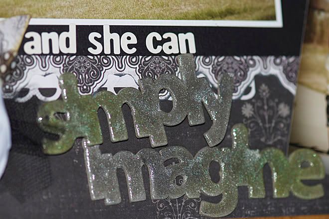
while my Smooch Spritz was still working, i did get the letters done. it has the most amazing iridescent powder in it. surprising. happy surprise. then i thought lets add some colour. my home-made glimmer mist: water in a mini-mister, lettuce alcohol ink and some turquoise perfect pearls. it definitely added colour. then i added my diamond glaze.
in after thought i think some of the houndstooth and black ink would have looked excellent here. but it will not happen now. i am just left with wondering what that would have looked like!
can i tell you how much i wanted to use my new Fiskars upper bracket edge punch on this one. not meant to be.

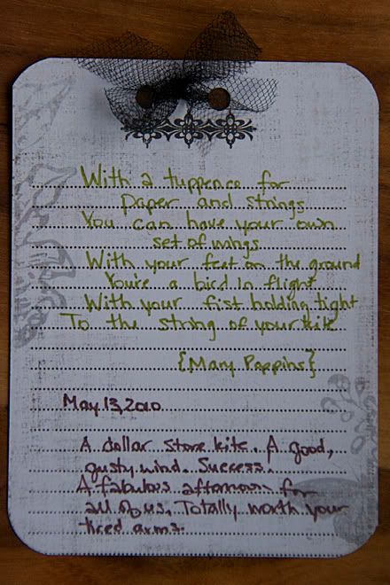
i wrote out part of the lyrics to Mary Poppins' "Let's Go Fly a Kite" in my journaling.
then it dawned on my the perfect title for the layout. thank goodness for those big Pink Paislee letters not having ultra stickiness. {for the record 99% of the time i am happy for "bad" glue on anything because i can change my mind...which you can see happens 99% of the time!}
since it is going to the store right away i stuck it on my Websters' Pages magnet board frame for the night. then i realized some feathers would be a cute addition. at this point i was happy. i think i changed nearly everything twice that could possibly be changed. too funny.
did you ever listen to: "And that's the Rest of the Story"? i am relieved that not all of my layouts take me on a long journey like this one. however, sometimes there is more to the story than what the layout tells.

I had a good laugh over this, Roxanne. You could have been commenting on my layout experiences! I agree about the bad glue, I'm always changing my mind, or trying to cover up my accidents! Usually my cat's eye ink pads tear off and fall right onto and only on white or light colored cardstock, especially after I have everything glued on. I have found that if you glue them back on with "Diamond Glaze" they stay on!
ReplyDeleteYour layout turned out beautiful!
Thanks, Jan!
ReplyDeleteIt's so nice to be reminded that I'm not the only one who has a problem layout. I knew if it was really going bad, at least I could get out the black paint!! ha!
all of these are wonderful. hurray for rainy days.
ReplyDelete