
already?!
it feels like summer just started.
it has been a good summer for all of us. we would all agree that it definitely improved once the summer weather kicked in. wearing jeans, socks and warm shirts was not our definition of summer. Aidan commented that the rain and cold was "not in the spirit of summer"! he cracks me up!!
a few weeks ago i was in the mood to try something new. of course i had just returned from Urban Scrapbook and was very inspired to try out the new products flying in and off the shelves. Jan had done a stunning layout (overnight!) with the new Pink Paislee Mistables.
i had Kiara's preschool photo from last year that had not been scrapbooked...so i thought it would be a great starting point. the purple in her shirt was the part that prevented me from putting it on a layout previously. purples are tough! i don't usually buy that colour paper to begin with. i love the natural colours more.
i grabbed a sheet of the new Tim Holtz Kraft Resist. thinking i would play off the browns. my safe zone. well. it did not work out well. i may chuck the sheet. for now i'm holding on to it....thinking i could use if for BEHIND other nice paper. sigh. it happens.
my confidence slightly shattered....i glanced at the beautiful Pink Paislee...and questioned if it was a good idea for me to try it today. i decided i had nothing to lose except the paper. again i started with brown inks. talk about blah! a little search through my mists....found a good purple from Shimmerz. then i had my "aha!" moment. i grabbed my LuminArt shimmering paint pots. once i had some purple paints it just fell into place. between those latter 2 products, the colours and design started to work for me.
i then created a "purple" layout. i was even able to make the purple match her shirt perfectly.
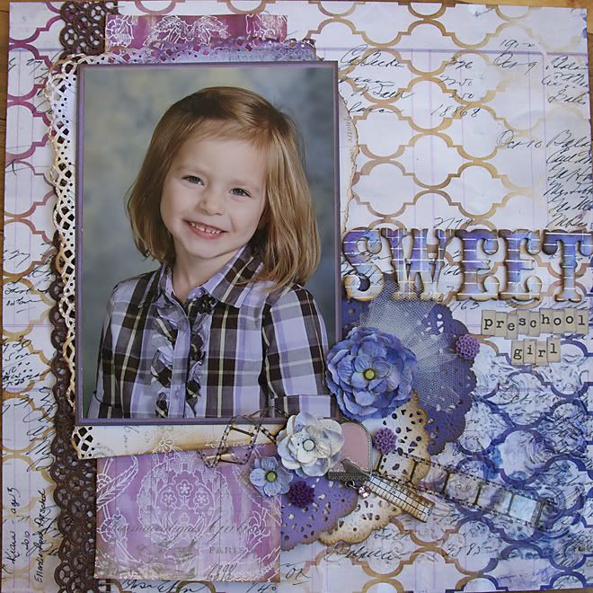
and that is the advantage to those plain boring sheets. you can customize them to whatever colour your inks and paints can dream up!
inks can be blended to create a new colour. a bit tricky, but it can be done. water helps.
paints can also be blended to create a new colour. or add more water to lighten the tone.
treat Glimmer Mists, Shimmerz, LuminArtes, etc like paint. shake and pour a small puddle on your non-stick mat or into a paint pallet. add water to lighten.
then grab a few cheap paintbrushes and play around. keep a paper towel handy too. even a scrap sheet of paper to test your colours. sometimes the colours will lighten or darken as they dry.....so get out your heat tool to speed it up.
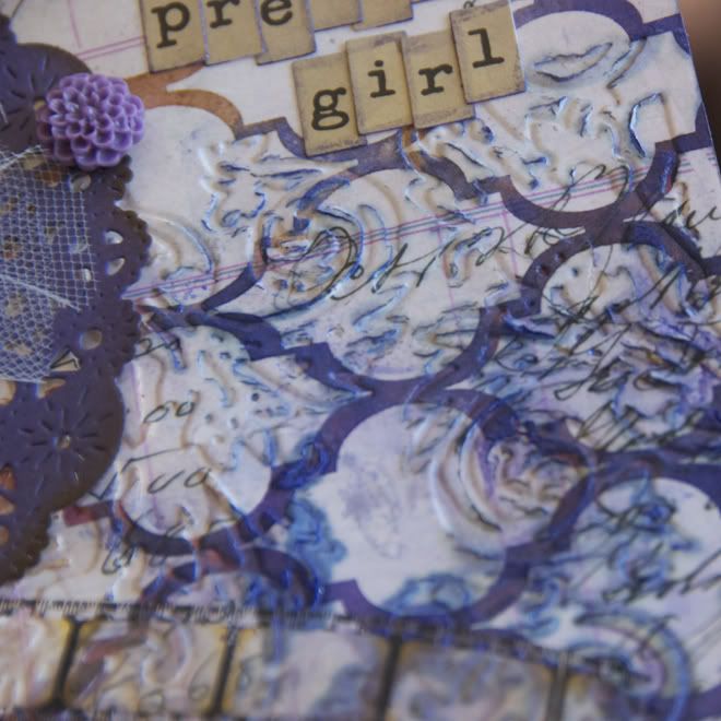
i took a risk and was curious. i embossed a corner of the paper with my Texture Fades and vagabond. it really creases because it is so heavy. but....afterwards i added more ink. the embossing cracked some of the thick glossy areas....and allowed the ink to seep in. something different.
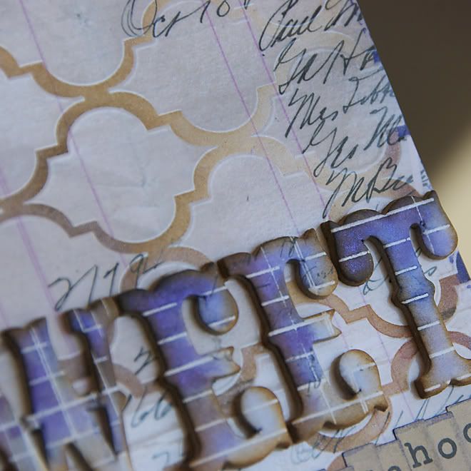
the mislabels chipboard letters are amazing!! see the sparkle? thank you LuminArte!! i used water and dabbed with the paper towel to keep the ink from being a solid colour on each letter. then i inked with dry ink to get the brown.
school is not in and this papermama learned a few lessons. i hope they will inspire you to try adding custom colours to your pages. it is amazing what a nice colour combination or great paper can do to take a difficult photo into something you enjoy looking at. when you just play around with inks and colours you learn more than you expected. sometimes you make mistakes. sometimes you surprise yourself. don't give up.
Great job on the lo - purple is a tough colour to work with and you really mastered it! The combination of purple and brown are lovely.
ReplyDelete