
here is the promised tutorial!
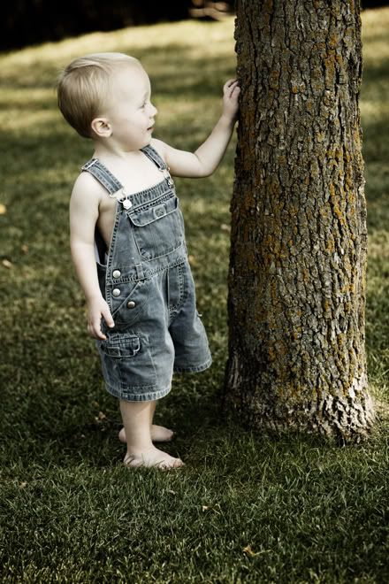
i am not using the same photos i did on this layout. i found this cute one of my son from many years ago. as much as he has changed, he is still the same cutie he was then. same smile, just on an older face.
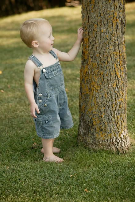
this is the photo that came straight out of the camera.
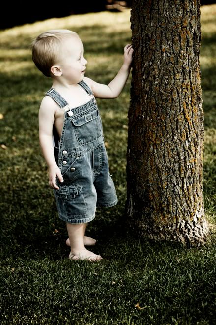
i should also add that i cannot take the credit for taking this photo. it was part of a photo shoot set up by Leah Warkentin from Design Pics. basically they do free photo shoots in exchange for using your photos for their stock photography business. the photographer will also give you a disk of the photos they took. i had a few favourites and learned some things at the same time. back to the tutorial!
this is the final result of my photo. a bit different than the ones of the kids on the bridge.
to start, open your photo in PSE (Photoshop Elements) or CS (Creative Suite or Photoshop).

the photo will appear enlarged in your screen. it should also automatically appear on the right column under "layers". there is a thumbnail version of the photo too. often it gets named to 'background'. simply meaning that it is your first layer. think of it like the foundation of the photoshop photo.

you now need to duplicate your background layer.
you can do this by clicking on IMAGE -> DUPLICATE in the pull down menu. or right-click the layer name and choose 'duplicate layer'. on a MAC, i just use the shortcut 'command j'.

make sure you have highlighted the 'LAYER 1", then click on SOFT LIGHT in the LAYERS pull down menu.
this is what the main photo looks like at this point. definitely more rich in colour.
this set of steps is very nice for a photo just on its own. but we will continue....

going back to the 'background' layer. click the eyeball icon in the little box to the left of the thumbnail photo. we want to HIDE this layer. notice we are back to where we started. or so it appears!

DUPLICATE "Layer 1". {you have to make sure that it is highlighted in blue when you do this.}

and back to "Layer 1" again. this time we are going to remove the colour from this layer.

if you have PSE, you may need to do this step differently. try ENHANCE -> ADJUST COLOR -> REMOVE COLOUR. don't over think this step. you just want to have a layer that is DESATURATED or BLACK AND WHITE.

in CS it is a bit different. this window pops up and you can adjust the colours in even more detail. i did not. i clicked OK and moved on.
this is what my photo now looks like.

back to 'Layer 1" again. this is our DESATURATED or Black and White layer. now DUPLICATE this layer.
it is getting quite dark now. notice the change in the denim overalls? cool, isn't it?!

DUPLICATE 'Layer 1' a third and final time.
super dark. definitely not a great one to print out. even if the denim overalls look amazing.
at this point you should have FIVE layers in total. the middle three are all in Black and White. the bottom one is still hidden. the top one is still the way we left it. all of the photos have been copies of the first one, to which we added a SOFT LIGHT effect.
sometimes it helps me if i label each of my layers. you can do that at any time if it helps you. for now i will left the names as my computer labeled them. hopefully it will help you compare my screen to yours.
only a few more steps remaining!

this time we are going to work from the 2nd layer from the top of our list, or the last layer we were working on. the label i have is Layer 1 copy 2. pull down the LAYERS menu and select SCREEN.

notice how much lighter the photo got?
okay. one more major step!

still keeping that 2nd layer highlighted....go to FILTER -> BLUR -> GAUSSIAN BLUR

i choose any number between 8 and 10 pixels. it creates the dreamy and glowing effect.
if your photo needs it, you can also add this same effect to the 3rd layer. again play around with the pixel size.

in this case, i went with 8.0 pixels. but i also chose to lower the opacity of this layer. the photo is quite dark around his feet, and very light around his face. i wanted to keep the dreamy effect...but not so much. one option i had was to use the erase tool for his face. but i was happy with the result of decreasing the opacity and went with that. this step i did not have to do with my other photos. sometimes you just get the perfect lighting and layout! and sometimes you don't.
this is my final result.

the last step is to FLATTEN your image. choose LAYER -> FLATTEN IMAGE.

and you will be asked about that layer you hid. click OK. your image will not be affected.
but you will notice that all of your layers disappear and you are left with just one.
you can choose to save your image with all of the layers, but it will be saved as a .PSD file. and it is HUGE. it is great to have while you are deciding on photo effects. but it is a big space waster for your hard drive. flattening the image will convert it to a .JPG file and is much smaller.
however, we can make it even smaller. a typical point and shoot camera is not really meant to take photos for enlargements above the 5x7 size. sometimes you can get a good 8x10 print, but often they are a bit grainy. my default print size is 4x6. however i make them a bit larger or smaller if i know they are for a specific project. sometimes i will add the size into the name so that i don't forget or confuse it with another similar photo. for instance i would label it "aidan 4x6.jpg".

if you are sending it to a commercial printer, you don't need to set your resolution too high. last i checked most printers are not capable of printing higher than 250 ppi (pixels per inch). my habit is to set my computer to 300 ppi. only because it makes me happier. ha!! if this is a concern just ask the photo manager at the shop where you are getting them printed.
if you are interested, i did a comparison between London Drugs and Costco this winter. London Drugs came out higher in price, but the quality also matched it. the paper was heavier and the photos definitely had more depth to them. Costco was the lower cost, but the paper was really flimsy and the colours lacked the pop. presently i still use my printer for the photos i use in my scrapbooks. it is just the most convenient. depending on my project and the type of quality i want in the photo will determine where i get them printed.
if i am sizing it for my blog i set it lower. computer screen resolution is 72 ppi. you can keep it at 250 ppi, but it won't make it better and it will take up a lot of space. this sizing is the same for sending photos to Facebook, email or other sharing sites. if your photo is too small, you can always try to crop it at a larger size. sometimes that helps.
okay! if you are still reading....kudos for sticking around!! this was really two posts in one. i hope you find this helpful. i should note that i messed up my own photos a few times. i didn't do the duplicating enough times to the right layers. i had to go back and undo things while i worked on my reading and comprehension skills...ha!!
GOSH...amazing tutorial, Roxanne! Thanks for sharing!!
ReplyDelete