as i searched i came up with a lovely blue. then it all came together. beach and travel was the theme that the paper spoke of.
Pat suggested that sand dollars and seashells would be a nice touch. or did the seashell suggestion come from me? i love brainstorming with her!
when i went to my files to look for photos that would work i made a very sad discovery. i had NO beach photos. in fact i had not taken the kids to a beach for 2 years. when i think of the last 2 years and all the busy-ness that was going on, it makes complete sense. however....SO SAD!!
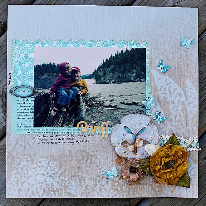
this is not my class layout. but pretty similar. just testing out stuff on my own stash before i started on the REAL layout!
journaling reads (i know i even added journaling! how novel of me): "...the closest we came to a beach that summer....Bow Falls and Lake Minnewanka....we will be sure to change that in 2010!"
the patterned papers are from October Afternoon. i think the Thrift Shop collection has been my favourite one of the year. little bits of it are showing up on lots of my layouts these days!
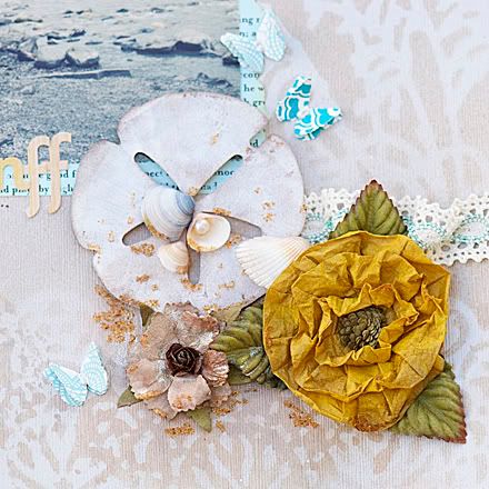
the sand dollar is a die cut from Urban Scrapbook.
the mustard yellow flower is Prima. it is sold flat looking. it has been in my stash for a few years now. i added some glimmer mist, scrunched it up and then set it with my heat gun. i definitely prefer it all fluffy!
the little brown flower began as a white "innoscence" Prima flower. glimmer mist and alcohol ink changed it in a major way.
the butterflies. well. they just belonged. i really love butterflies on summery layouts. they are so hot right now. i used some liquid pearls for their bodies. doubled them up....gluing the bottom butterfly on the paper completely. then gluing only the centre of the top butterfly. i've seen that effect on several layout right now. love it, which is why i did it here!
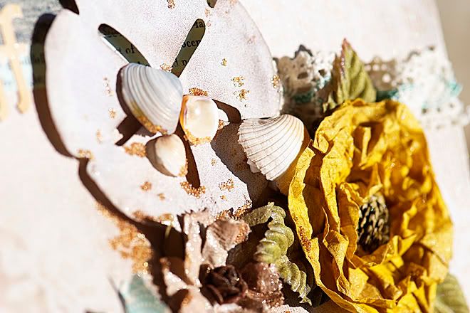
thank goodness for foam pop dots!
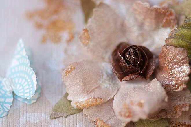
and the microbeads came back again. this time i pre-tinted them. it was a mixture of sprayed with glimmer mist and some were inked with alcohol inks. then i mixed them together. lay them on some paper towel...then mist. or drop with the inks. as they dry, they stick together. once they are all dry they will separate again. i picked up some little plastic containers that hold them securely. i shake the container and that separates them all completely. it is a time consuming process, but worth the effect you can achieve. you can see the variance in colour intensities of the beads. love that!
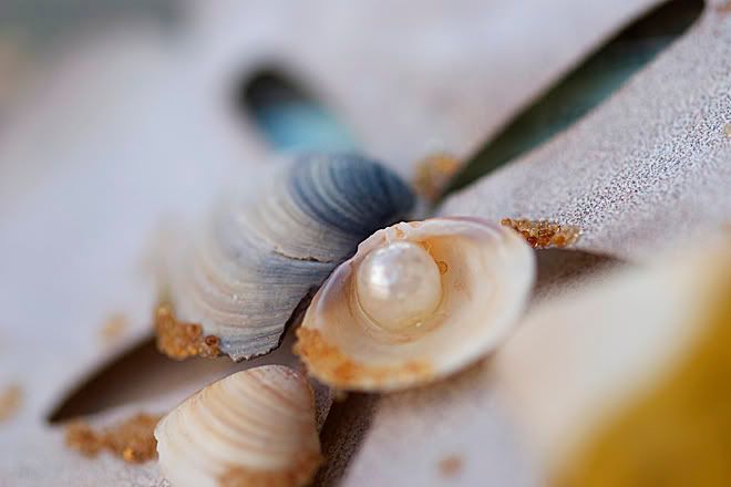
i am pretty sure i saw a layout or project that included a pearl inside a shell. could have been an advertisement too. diamond glaze kept the pearl in place without making the glue majorly visible.

No comments:
Post a Comment
Thank you for taking the time to comment!