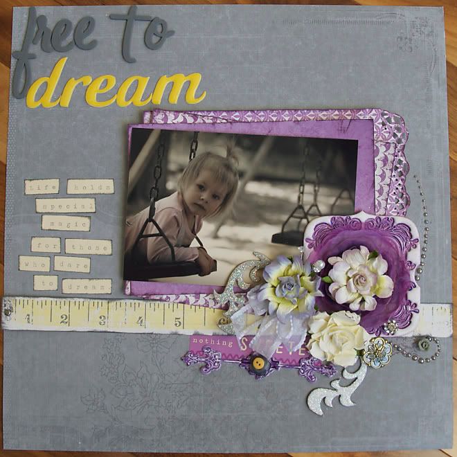
i was so inspired by the deep colours Jan got on her Pink Paislee artisan elements. one day i got out a few of my own elements and tested out other methods of getting colour.
i did create a fantastic one using caramel, reds and greens.....but had no 'perfect' paper to go with it!
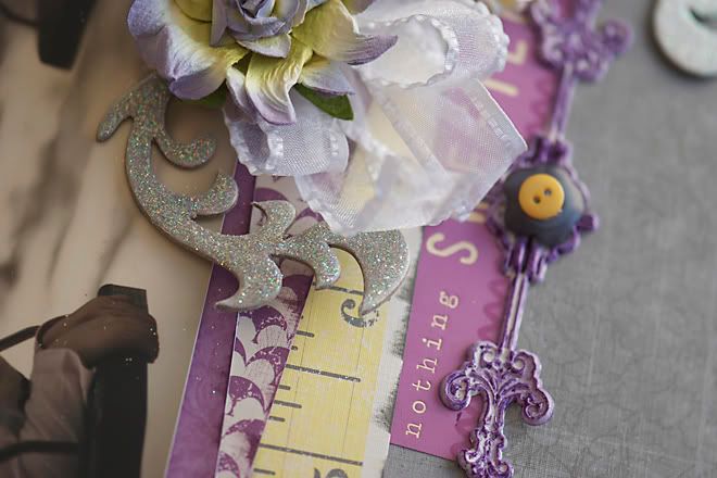
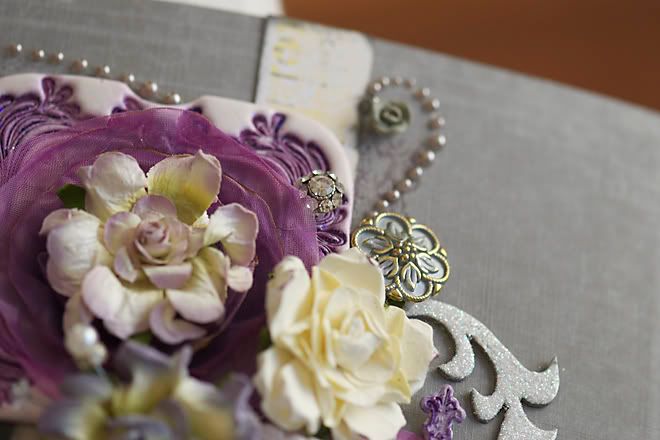
i used the new Tattered Angels Glimmer Glaze and loved how it looked. deep and rich, yet you can easily wipe it away on this product. well, not completely. but you get just a bit of the colour. basically more control than with alcohol inks. and i didn't have a purple alcohol ink to go with my glaze. i added even more glitter with some Stickles. i just rubbed it across the surface and the glitter stuck in the crevices.
being lazy i did not want to go and find a new photo and go to the trouble of printing it. confession! instead i looked through my 'extras' and found one that sort of matched the purple.
then i needed to find some purple paper. not a usual colour for me to use. i had a few sheets. but then i was totally stumped. i was beginning to think that i would need to move on to a third option.
instead i took a break and had a whim to visit the Colour Room. they have the colour palette and a sketch for a starting point. i was shocked when they had purple as one of the colours. then shocked out of my chair when i saw they had other colours that i had on my desk....grey and yellow. no way!
i don't usually use sketches. and when i do, i tend to not follow them well. which pretty much eliminates me from any team that requires a sketch to be followed exactly! haha!!

they are on palette #28. i am not sure if i would have been comfortable trying this combination on my own. but i like how it all looks together. thank you Little Yellow Bicycle! i'm glad i ended up picking up this set.

i had these glittered scrolls left over from another project and thought they worked nice here. even if they were not the same. there were a few leftovers here that i was happy to use up! you can also see the glitter glam on the artisan elements here. i am in love with their most recent set.

when i showed the layout to my daugher {who is only 4 years old} i asked her opinion.
mistake?
she says, "i don't like it."
then she points to a layout i did a few years ago and tells me she likes that better.
to risk destroying all my self confidence in one blow, i am going to choose to believe that she simply prefers the colour PINK. this week. PURPLE is just not good. this week.
yeah. let's go with that thought.

No comments:
Post a Comment
Thank you for taking the time to comment!