
this does NOT look like spring.
where, oh where, is spring?!
will it come this year?
aside from the falling snow, i taught a couple of classes this past week. we had glitter falling and flying through the air! very messy and a lot of fun.
one of our Urban Girls was recently added to the Creative Scrappers design team! congratulations Jody!! it's great to see other fabulous CANADIAN companies and blogs. they have great taste in choosing their designers too....Jody is soooo creative and inspiring!!!
Jody introduced us to the Creative Scrappers blog and their sketches as well. i see that i am not the first to try one of their sketches this month! in fact, i found this sketch really helped me focus on my layout for our store design time layouts.....

this sketch was from last week.
and here is my interpretation....

the technique was to use border punches. in this case i kept it pretty simple. i loved how the Iron Gate border punch by Martha Stewart looked with the Little Yellow Bicycle papers. there are a few borders - barely visible - on their patterned papers that look similar.
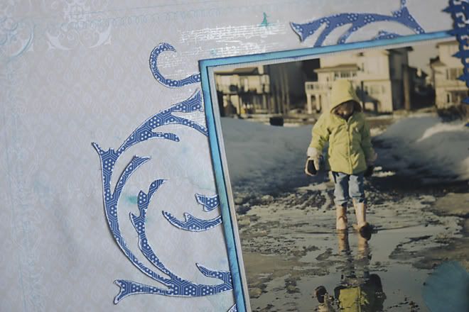
since it was a photo from last spring....and it had to do with puddles...i decided to add a few of my own! i dropped some colour from Carribean Blue glimmer mist onto the background page, then spritzed those droplets with plain water. i love the effect!
their was another fine detail of music notes on one of the sheets....so i stamped some music notes at various spots as well. i used my pearl paint dauber, and a mix of Carribean Blue Glimmer Mist and Dirty Martini Glimmer Glam (green). the glimmer colours were just puddles on my non-stick mat, so they are not clean and crisp images.
to follow the sketch with the circle, i decided to use my flourishes die from the Tim Holtz Sizzix Alterations.
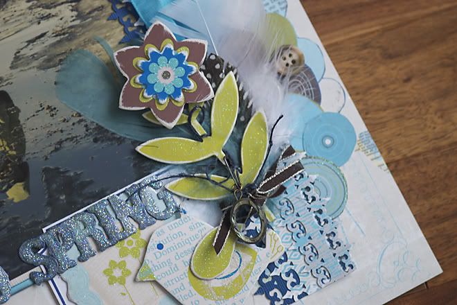
the letters we used are grungepaper. seriously, that product can handle layers of all types! there is no secret to the final outcome. it was just a result of lots of attempts to colour match. i started out with my pearl arcylic dauber. then i decided it needed more colour. spritz of blue glimmer mist. too light and too blue. then i added the green glimmer glam. too green. more mist. more dauber. more mist. then the glitter in the glam looked more like lumps than glitter! out came my iridescent glitter. it matched the Little Yellow Bicycle glitter perfectly! and my ugly lumps disappeared! ha!!
i LOVE how the other girls used their punches. lots of variety. i do like how i layered my paper with the punch, and turned it into a decorative strip. BUT, the girls really showed the versatility of the border punches with their layouts. so do check out the pages that will be on display starting this week. they are sooo inspiring!
stay warm! and keep out of the drifts.
if you see signs of spring....could you send it our way? green grass will be such a pleasant sight.
I absolutely LOVE this layout. I love the details and how everything matches perfectly right up to the blue feathers and the die cut bird. GREAT JOB!!!
ReplyDelete