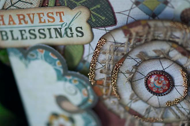
have i mentioned before that Basic Grey is one of my favourite companies? and this 2 page layout is packed with them!
i've also been doing some more experimenting with the Radiant Rain by Luminarte. i discovered a similarity to watercolour paint. the first adult art class i took (and i know i have mentioned it before!) was a watercolour class by Francis Alty-Arscott. it was very humbling when i learned that she was a well-known and a professional artist. so silly when i think back on it.... she was amazing with the brush. but she also was a great mentor to all of us, reminding us constantly that art cannot be repeated exact. i took a lot of what i learned and applied it to my art classes with my elementary students - back in the day! did i just get side tracked again? focus, focus, focus!
so, this paint is like a shimmery watercolour paint. or a mist. it all depends. as it turns out a decent watercolour brush, paper towel and a splash mat will do wonders.
another variation i tested with the paints:
shake your bottle well. then pour out a teaspoon of the paint onto your splashmat. i know this sounds silly, but let it sit for a few seconds and watch what happens. the colour settles to the bottom. stir it up with your paintbrush and the colour returns. you will have to do this when you return to the puddle for more of the paint.
just as with watercolour, add water to lighten it. you can also mix colours and create new ones, or new hues.
then paint it on your paper! or chipboard...or grungepaper...
depending on your brush, you can have a lot of control where the colour goes.
try this. wet the paper with water first. then add your paint. just apply the paint in one area first and watch as it bleeds into the water.
{i want to experiment with this paint on acrylics, microbeads and even some embellishments that could use some sprucing up!}
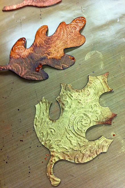
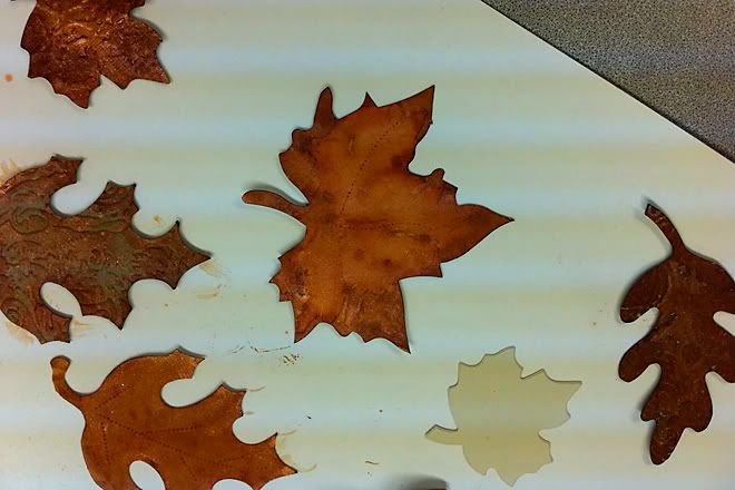
isn't the colour incredible?
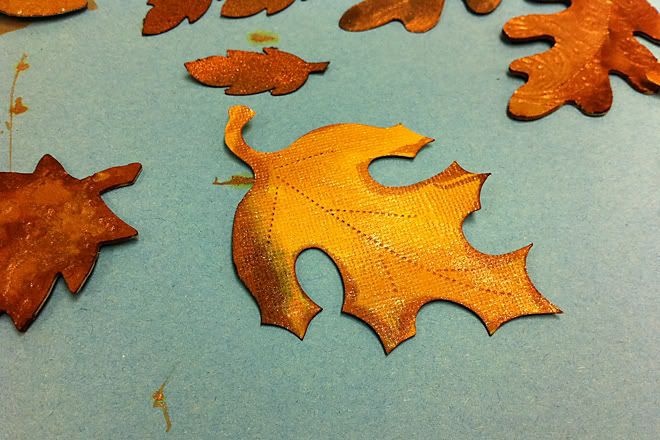
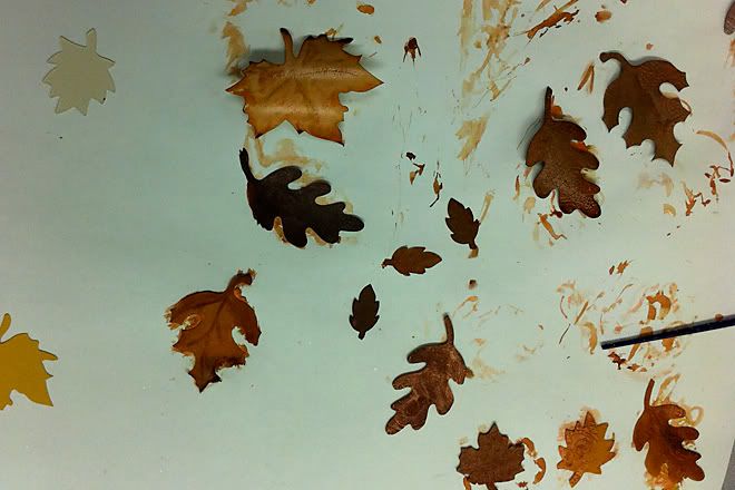
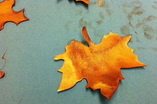
each leaf turned out to be very unique.
the copper colour painted on solid and dark was stunning!!
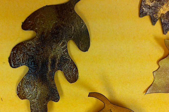
i'm pretty sure this one had the copper and cinnamon combined as dark and concentrated as it gets.
as the paint dries, the colour becomes more subdued. even with the fully painted portions, there is still some variance of the hues.
yes i admit i did try to swap out my leaves with some of my students. i'm sorry! but yours all looked so good that i had to try it. the reds were so deep and rustic. thanks for letting me take photos as consolation.
we may get in another shipment, but the same company makes little pots of watercolour paints called "Twinkling H20's". they need to be misted with water first, and then you paint with them. the leaves on this layout were done with those paints. i used 3 different colours on those leaves, and blended the colours.
as i mentioned to the girls, my dear husband and i got away to the mountains for a much needed break. fall colours were still in abundance.
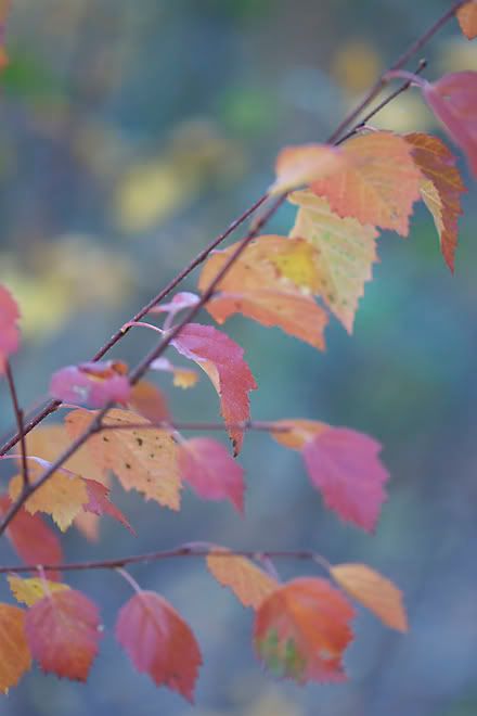
aren't these leaves so pretty? the colours of fall are our only consolation for the long cold winters here in the prairies. in my humble opinion.

No comments:
Post a Comment
Thank you for taking the time to comment!